This post follows on from Visualisation and Visual Tools - A Resource List

A visualisation can be everything from a complicated multi-dimensional data set that incorporates time and geographic information, to a couple of blobs that represent and idea.The Periodic Table of Visualisation may help you broaden your visualisation undertsanding and maybe reveal the difference between a Sankey Diagram and an Hyperbolic Tree or reveal the layout of a Radar Tree and a Mindmap.
The Information is Beautiful site lets you browse lots of different visualisations and visualisation styles. I'm particularly drawn to those visualisations that aren't complicated but convey a simple idea well, like the one below.

The Basics
For most simple visualisation needs, you really only need something simple. The tools in Google Forms ( to create surveys ) and Google Spreadsheets ( to store and manipulate your data ) and Google Charts ( to display your data in interesting ways ) are enough for most people.
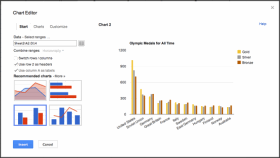
As well as bar, column and line charts, Google Spreadsheets can display the more esoteric Tree maps, Trendlines, Maps and Bubble charts once you have your data organised into the correct format.
Other Visualisation Tools
You may end using a variety of tools. Go and explore these other tools to get a feel for what's possible.Tableau is easy to use and let you explore your data in interesting ways. This video shows how to view a public data set of graffiti in New York within an interactive Tableau visualisation and is worth watching to get a feel for what is possible. Go watch this.
Infogr.am is a simple tool for creating data visualisations.
There are lots of visualisation types and visualisation tools at IBM's Many Eyes ( requires the latest Java which for me only works with Firefox ) and is worth exploring to discover what is possible.
If your dataset is large, or needs to integrate with a large dataset, then Google Fusion Tables can import Google Spreadsheets and show data in a number of visualisations. For example;
- in this post I was able to show a bar chart of York City Councils spending in a simple chart, made from a spreadsheet with hundreds of rows.
- this example shows every UK charity on a map.
Google Fusion tables are a fantastic tool if you simply have a large dataset or you want to integrate the data you have a collected with a large dataset. Here is a quick tutorial to introduce you to how they can be used.
The Guardian has a guide to the free tools you can use for data journalism.
For those comfortable with Javascript and HTML you can create your own live and interactive visualisations that might have completely new approaches to presenting data. For example, take a look at these two interactive visualisations built using Javascript, the UK Government Daily spend and UK Government departmental spending.
Here are some examples of Javascript libraries built for visualisation.
For those comfortable with Javascript and HTML you can create your own live and interactive visualisations that might have completely new approaches to presenting data. For example, take a look at these two interactive visualisations built using Javascript, the UK Government Daily spend and UK Government departmental spending.
Public Data Sets
In many circumstances, often if collecting geographical data, there are cases when you might want to consider integrating the data you collect, with larger or more complete datasets. There are many datasets worth exploring to see if they can contribute to your visualisation.
Note: Google Refine is a geeky but hugely essential tool that helps to clean your data if it is very messy and unregular.
Written by Unknown
We are one of the initiators of the development of information technology in understanding the need for a solution that is familiar and close to us.


0 comments:
Post a Comment